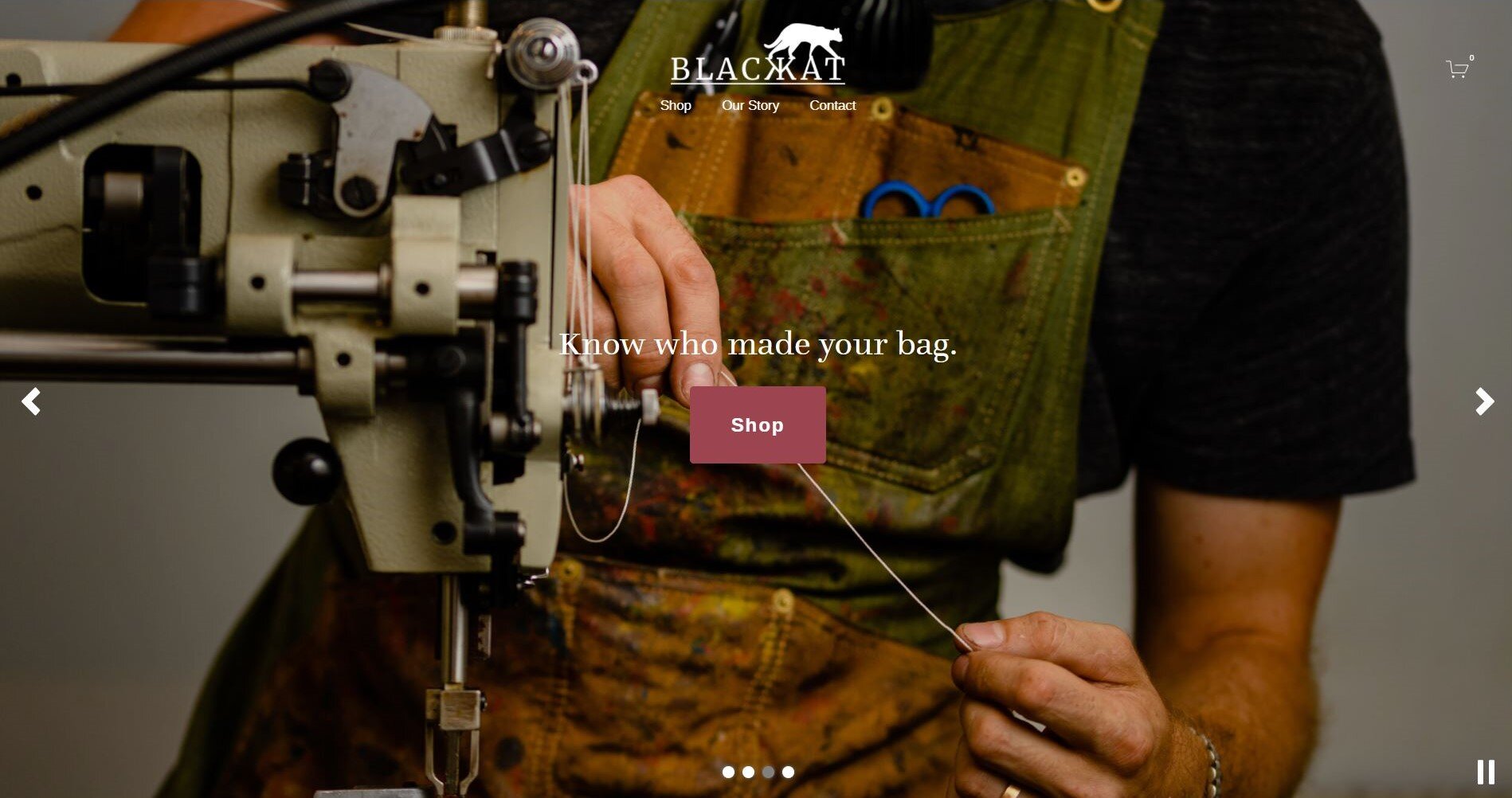
Blackkat Leather is a creative brand providing handmade leather goods with a contemporary, stylistic flair.
After several successful years as an established creative business, the folks at Blackkat Leather wanted to update their design presence with a new pack of logos that reflect their style, and a website to match.
The Road to New Designs
When creating sketches for the new identity, a few things were given: the cat will stay, the slab-serif typeface is the right style, and the simplicity of the straight line of text is the right simplicity. With those parameters in mind, I took to sketching cat silhouettes.
Since the cat is the character with whom we identify, whatever he’s doing is important (the cat is inspired by Blackkat’s actual black cat, Roro). Is he sitting? Jumping? Is the tail curled or straight? In the end, we settled on the confident strut and slight flick of the tail that seemed to fit perfectly on top of the text.
The last element to get right was the typeface. After experimenting with several serif and non-serif typefaces, we settled on this bold slab serif. It holds the same connotations of the industrial age as the original logo, but the sharp angles and slight weight shifts in the strokes encourage a more contemporary feel. The double K was designed specifically for this logo as well; to avoid similarities with Cyrillic characters, the strokes were adjusted and overall character width shortened so the result blends with its fellow letters.
Orignal
New
Logo Family
The Website
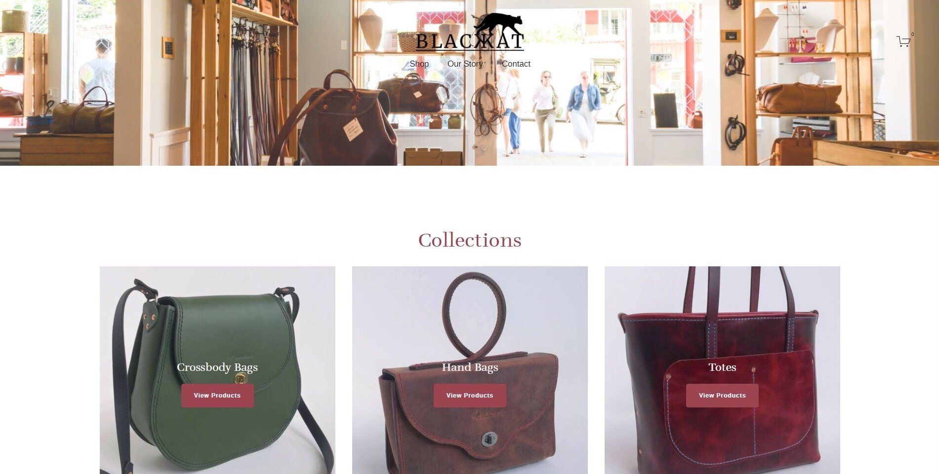
Built from scratch, the new website showcases a digital storefront featuring a collections page for ease of navigation and incorporates several versions of the cat throughout the pages,
View the full website at www.blackkatleather.com
The introduction of a new look
The element of the cat elegantly lends itself to being a character that walks us through not only the transition from the former logo to the new identity, but throughout the new brand itself.


